A blog page dedicated to (trying to) document the different designs this website’s gone through over the years!
Since I’m self-taught when it comes to webdev stuff, it’s taken me a long time to get the site to where it is today! Also, sometimes I get bored of how it looks and redesign it.
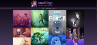
2025
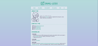
I’ve gone back to a more understated, “flat” design style this year. Most of my dev time has gone into migrating everything ever over to 11ty, which should make updating and maintaining the site in future much much easier!
Even though this flatter design is arguably a little boring, one of the benefits of a design like this is that it lets my art take most of the focus.
If you compare it closely to some of the previous designs, I think the throughlines between all of the different iterations of the site are fairly apparent! To me, this design feels like a pretty natural evolution.
Some aspects will definitely want tweaks and adjustments in future, but I’m quite happy with the direction things have gone in as a whole.
2024
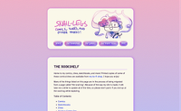
I wanted to try making a design that felt more tactile. That said, I’d been feeling the strain that comes from managing a really big static site without a static site generator since the previous year. So the site didn’t see much activity, and the redesign was ultimately left incomplete.
I think I had kinda mixed feelings about the 2024 design, but I didn’t have a lot of patience for working on the site in the state that it was in. So it ended up lasting for probably a little over a year?
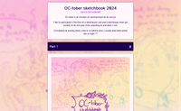
I also made a custom page for my 2024 OC-tober sketchbook!
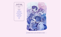
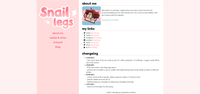
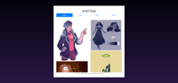
2023
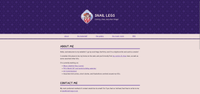
I’m pretty pleased with how my main 2023 design (second image) held up! I don’t think I’ll ever make a design that I’ll be happy with forever, but the design with the sidebar lasted almost a full year I think? Which is pretty damn good going.
I definitely liked the light mode version more than the dark mode one; it might have lasted a bit longer if I was a light mode user at the time.
This was the year that I learnt about CSS variables and prefers-color-scheme media queries!
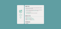
My end-of-year redesign had a distinctly wintery vibe, and I wasn’t sure how long it’d hold up, but I did like it! The base HTML would ultimately end up being rethemed the following year.
2022
The site’s design went through a lot of iteration in 2021!
I wanted to write cleaner, more semantic HTML & CSS, and Bootstrap was kind of… div hell? Possibly I wasn’t using it very well.
Looking back on it, I’m not really a fan of the gradient bg version up top compared to the flat-colour two. That was something I did becuase I wasn’t ready to let go of the layout I’d made, even though it was starting to get a little stale to me… No wonder it didn’t last much longer.
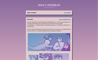
Also, look at how pretty the microblog is! Very cosy.
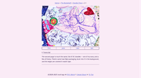
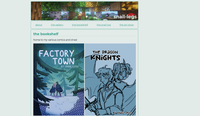
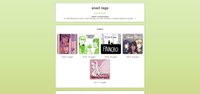
2021
This coincided with a period where I was regularly streaming (mainly comic work and minecraft, as a vtuber), so of course the styling had to be pink and cutesy to match the aesthetic of the streams. I had rediscovered the colour pink. It’s a good colour.
I don’t think I was fully that happy with either of the designs shown above. They felt… a little unbalanced, somehow? But I’m pretty sure the version of the site in the first image was the first that I actually started uploading comics to. I believe this is the time period this script came from.
2020
As you can see, I was quite into an outer space theme/aesthetic! I’m not sure if the green one was just placeholder colours maybe? It’s certainly the oldest design I can get a screenshot of.
There were a few even earlier attempts at webdesign, but sadly I can’t find archives of them…